Brand & Campaign · Municipal Government · 2026
Organization represented: Town of Wendell, North Carolina
Wendell, NC Brand Guide (Re-Brand)
An independent municipal identity concept for Wendell, North Carolina, exploring how logo design, typography, color, voice, and everyday civic applications could work together as a recognizable, community-centered brand system.
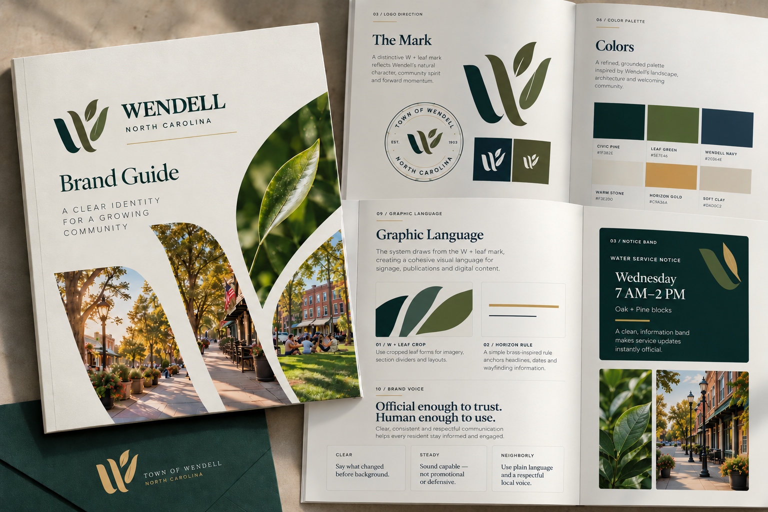
Concept project created by Harbor Creative to demonstrate our approach and capabilities. This work was not commissioned by the organization represented.
Featured Project Resource
Municipal identity concept guide exploring the proposed Wendell visual and communications system.
View Full ProjectThe brief
A town's identity lives in far more places than its seal or logo. It appears on public notices, community programs, digital services, street-level communications, and the everyday materials residents rely on. The challenge is to create a recognizable system that feels rooted in a place while working consistently across very different applications. Harbor Creative's independent Wendell rebrand concept explores that challenge through a complete municipal identity framework: a primary mark and supporting configurations, typography, color, graphic language, photography direction, tone of voice, and practical government communication guidance. The design balances warmth and approachability with the clarity and credibility expected of a public institution. This is self-initiated portfolio work illustrating a possible direction; it was not commissioned, adopted, or approved by the Town of Wendell.
Objective
Explore a distinctive, adaptable municipal identity that reflects Wendell’s sense of place while establishing practical standards for clear, consistent communication across civic touchpoints.
The approach
Harbor approached the project as a complete civic identity system rather than a cosmetic logo refresh. The process began by defining the visual and verbal character the brand needed to communicate: welcoming, grounded, civic-minded, forward-looking, and distinctly Wendell. From there, the identity was expanded into a practical system of primary and secondary marks, typography, color standards, graphic elements, photography direction, voice principles, government-specific writing guidance, and examples of how the brand could adapt across municipal departments and public-facing applications. The brand guide was designed to answer not only what the identity looks like, but also how a town should use it.
Concept scope
The scope below describes the concept. Published files and artwork, where available, are shown separately above.
- 01Municipal brand strategy
- 02Primary town logo
- 03Secondary logo configurations
- 04Supporting brand marks
- 05Color palette and usage standards
- 06Typography system
- 07Logo clear-space and sizing standards
- 08Graphic language and supporting elements
- 09Photography direction
- 10Brand voice and tone guidance
- 11Government writing principles
- 12Department and program application guidance
- 13Public communication examples
- 14Digital and social applications
- 15Print collateral concepts
- 16Community campaign applications
- 17Municipal brand standards presentation
Related services
More work